Nearly every guest who walks through your door looked you up first. They checked the hours, scanned the menu, decided whether the room looked like the kind of place worth a Friday night, and all of that happened on a phone screen in well under a minute. Your website is the front door most people actually use. It is also the only part of your online presence you own outright: not the review site selling ad space to the taqueria down the block, not the delivery app renting you your own customers at 28 percent. Building one used to mean an agency, a twelve-week timeline, and an invoice with a comma in it. That stopped being true. A restaurant website builder that pulls from the menu you already maintain can have you live before service tonight.
What follows is the practical version. What guests look for and how quickly they look for it, the four build paths and what each really costs, the technical decisions that matter versus the ones vendors invent so they can bill you, and how to wire the site into the systems already running your floor so the menu never goes stale. If you are running QR menus and mobile ordering, you are further along than you think: the same menu data that feeds the table QR code can feed the public site, which means one update instead of two.
Your website has jobs, not sections
Most restaurant sites get built backwards. Somebody sketches a list of pages (Home, About, Menu, Gallery, Contact), fills them with words, and calls it done. Then the site sits there, gathering dust, converting nobody.
Flip it. Your site has three jobs, and every design decision should serve one of them.
Job one is winning the comparison. Someone has your place and two others open in browser tabs. They are looking for a reason to pick you and a reason to rule you out. Job two is servicing the guest who already chose you: they need the address, the phone number, tonight's hours, whether you take walk-ins. That guest is impatient and often already in a car. Job three is capturing the transaction, a reservation or an order, on your property rather than on a platform that charges you for the privilege.
Notice what is missing. Nobody visits a restaurant website to read your founding story. They might read it after they have decided, while they wait for the table to be ready. Put it in, keep it short, and stop treating it as the centerpiece.
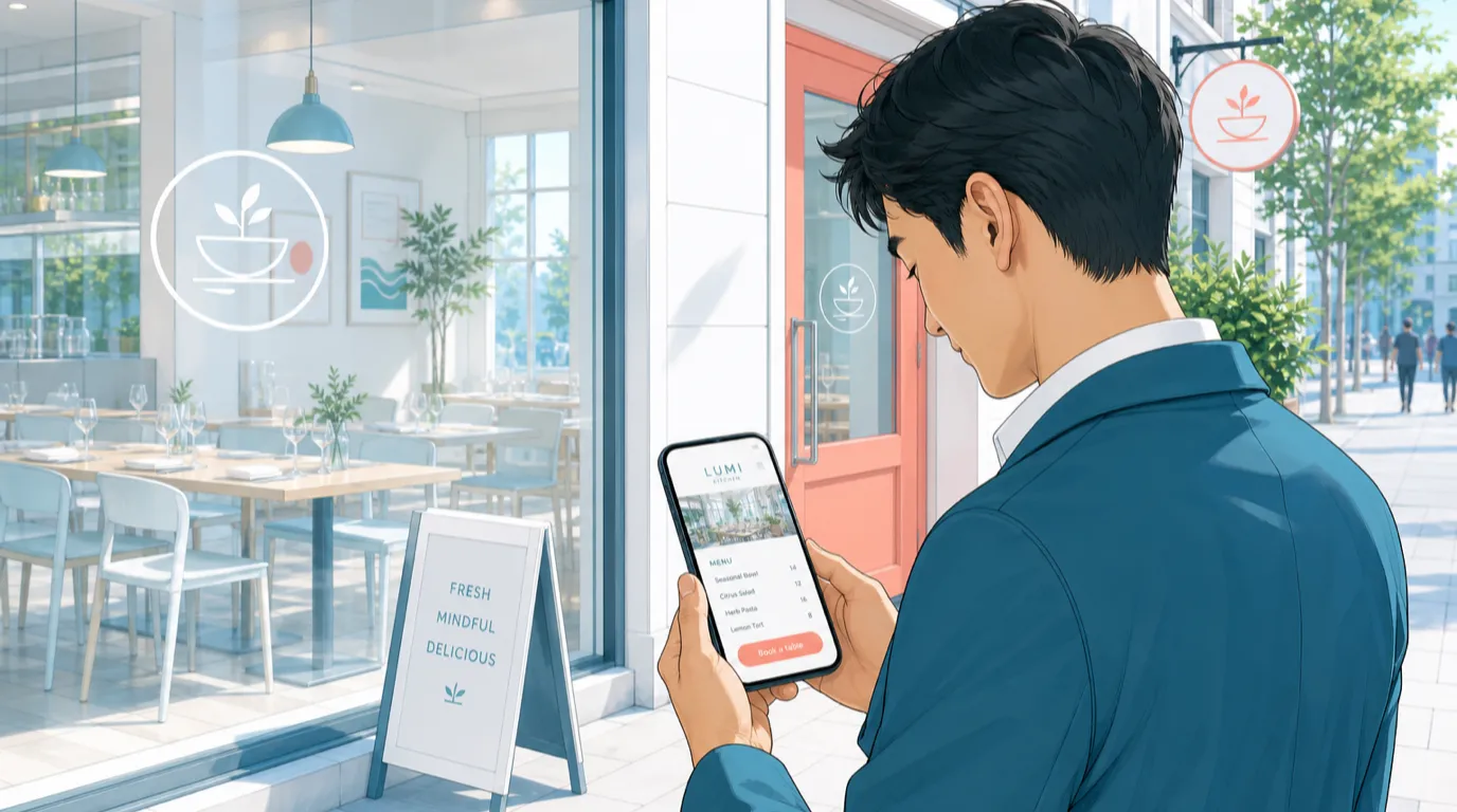
Two numbers shape everything else. Somewhere between 70 and 85 percent of your traffic is mobile, higher if you are in a tourist area or near a transit hub. And your most-visited page is almost never the homepage. It is the menu, usually by a factor of two or three. Design for a person standing on a sidewalk in the rain, holding a phone in one hand, looking for tonight's prices.
The five-second test
Open your current site on your phone. Start a timer. Can a stranger find your hours, your address, your menu, a photo of the room, and a way to book, in five seconds of scrolling?
Most cannot. The usual failures are predictable: a full-screen hero video that eats the first scroll, a cookie banner covering the phone number, hours buried in a footer three taps down, and a menu that opens a 4 MB PDF.
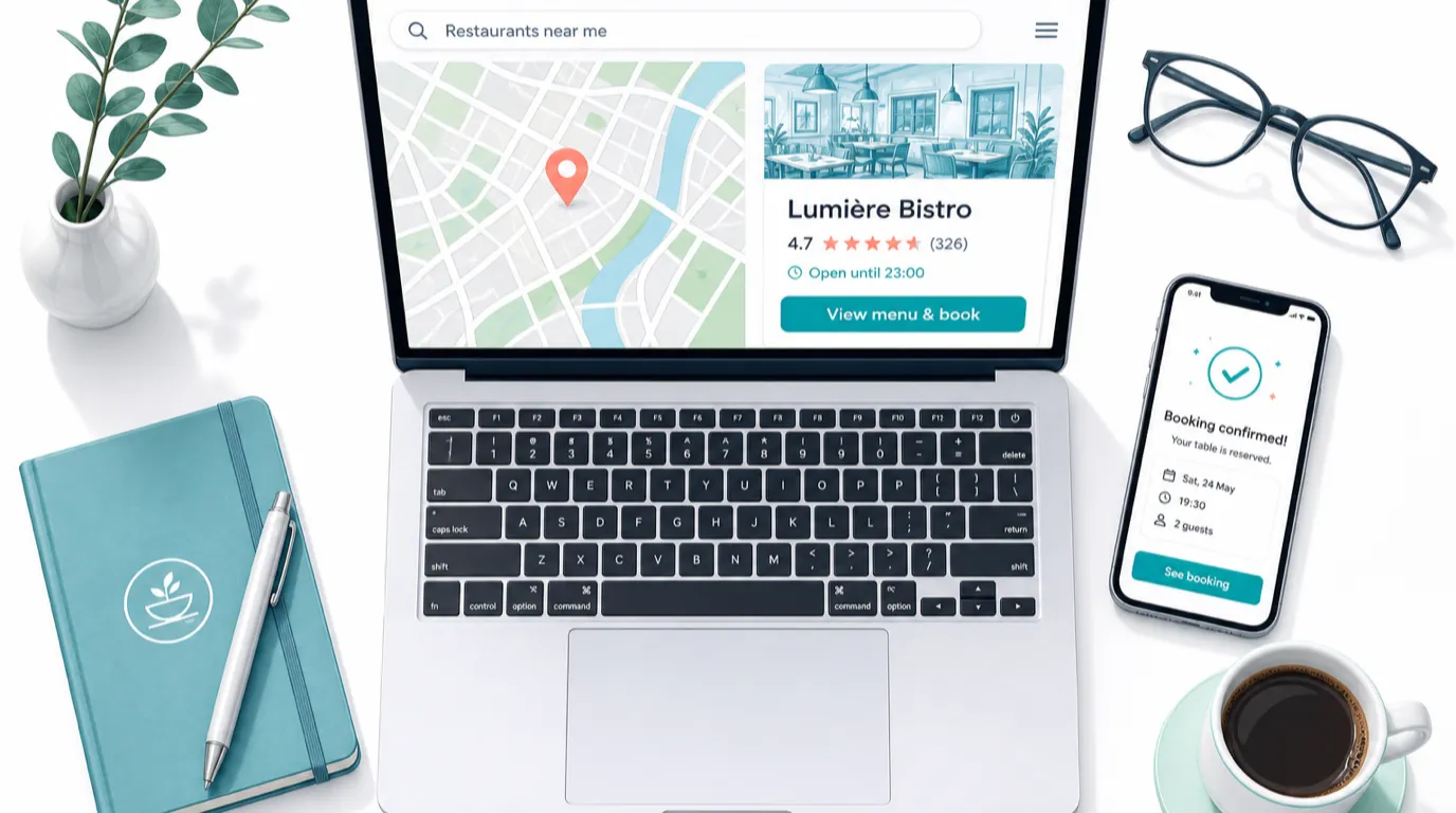
Fix the top of the page first. Above the fold on a phone you want the name, one line saying what you are (a wood-fired pizzeria in Kreuzberg, a 22-seat natural wine bar), tonight's status, and two buttons. The status line matters more than people realize. "Open until 23:00" beats a table of opening hours because it answers the actual question. Restaurants that show live status get noticeably fewer phone calls asking if they are open, which your host stand will appreciate on a Saturday.
The two buttons should be your highest-value actions, and there should be exactly two. For a full-service dining room: Book a table and View menu. For a takeaway-heavy operation: Order now and View menu. Adding a third and fourth button does not increase bookings, it dilutes them.
One more thing for the five-second test: your phone number needs to be tappable. A number typed as plain text on a mobile page is a small daily tax on your business. Wrap it in a tel: link and it becomes a call.
Four build paths, and what they actually cost
There is no universally correct answer here, but there is usually a correct answer for your situation, and it depends more on how often your menu changes than on your budget.
The general-purpose builder. Squarespace, Wix, WordPress with a theme. Roughly 15 to 50 dollars a month, plus your time or somebody's. Templates look good. The catch is that nothing knows anything about restaurants: your menu is a page you retype by hand, your hours live in three places, and when you 86 the halibut, the website keeps selling it. Fine for a wine bar with a menu that changes twice a year. Painful for a place with daily specials.
The freelancer. Somewhere between 1,500 and 6,000 dollars for a custom build, more in expensive markets. You get something that looks like you rather than like a template. The risk is not quality, it is what happens in month seven when you need a price change and the freelancer has taken a full-time job. Ask two questions before you sign: what platform is this built on, and can I edit the menu myself without calling you? If the honest answer to the second is no, negotiate a retainer or walk.
The agency. 8,000 dollars and up, often much more, typically bundled with photography, brand work, and an ongoing retainer. Justifiable for a group opening its fourth location or a fine dining room where the website is part of the positioning. Hard to justify for a single neighborhood restaurant, where the same money buys a lot of local advertising or a new combi oven.
The platform-integrated site. Your POS or hospitality platform generates the site from data it already holds. Usually included or close to it. The menu is not a page you maintain, it is a view of your live menu: change a price at the terminal, the website changes. This is the path that eliminates the single most common failure in restaurant web presence, which is not ugliness, it is staleness.
My honest bias, having watched a lot of operators do this: unless your menu is genuinely static or your brand needs a bespoke experience, the integrated route wins because it removes the maintenance step, and maintenance is the thing that always gets dropped during a busy August.
Own your domain, ignore the upsells
Buy the domain yourself, in your own name, with your own credit card. This sounds trivial. It is the single most common way restaurants lose control of their web presence.
The story repeats: an agency or a cousin registers the domain under their account as a favor. Three years later the relationship has soured or the cousin has moved, and the restaurant cannot transfer its own address. Renewals lapse. Somebody else buys the name. I have seen a fifteen-year-old bistro lose a domain it had printed on every menu, matchbook, and delivery bag it ever produced.
Register at any reputable registrar for around 12 to 20 dollars a year. Turn on auto-renew. Turn on the free privacy protection so your home address is not in a public database. Keep the login in the same place you keep your insurance documents, not in a WhatsApp thread.
On the name itself: shorter is better, .com still carries the most trust in most markets, and a country domain (.de, .fr, .it, .es) is a fine choice if you serve one city. Avoid hyphens and creative spellings, because you will be reading this address aloud over the phone for the next decade. If the exact name is taken, adding your neighborhood or city usually beats adding "restaurant" or a number.
Hosting is where the upsells live. For a restaurant site, the honest requirements are an SSL certificate (free and automatic almost everywhere now, and non-negotiable, browsers flag sites without one), decent speed, and automatic backups. You do not need a dedicated server. You do not need the 40 dollar a month "business pro" tier. If your site comes from a platform, hosting is usually included and this whole section stops being your problem.
Never publish your menu as a PDF
This deserves its own section because it is the most common serious mistake on restaurant websites, and it is still everywhere.
A PDF menu fails on every dimension that matters. It is slow: menu PDFs regularly run 3 to 8 MB, which on a weak mobile connection means a spinning wheel and a guest who gives up. It is unreadable on a phone without pinching and dragging around a document laid out for A4 paper. It is invisible to search engines in any useful way, so the dishes you are known for never appear in search results. Screen readers cannot handle most of them, which is both an accessibility failure and, in a growing number of jurisdictions, a legal exposure. And it is always out of date, because updating it means opening a design file somebody else owns.
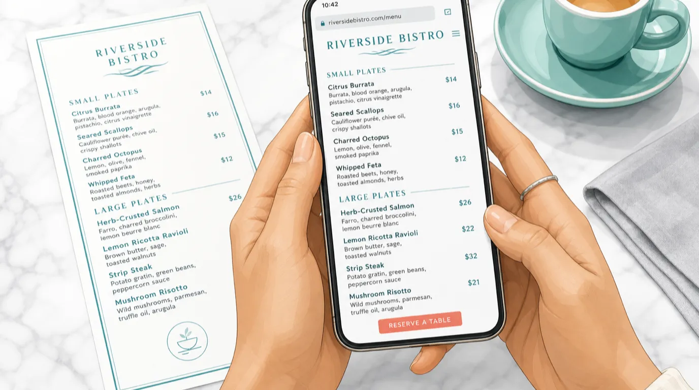
Publish the menu as a real web page. Text, headings, prices, allergen tags if you carry them. It loads instantly, it reads properly on a phone, it can be translated, and Google can index every dish, which is how you start showing up for "cacio e pepe near me" rather than only for your own name.
Keep prices on it. Restaurants sometimes hide prices thinking it protects the experience. It does the opposite: a guest who cannot find prices assumes the worst and picks the place that told them. If your menu changes constantly, that is an argument for a menu driven by your POS data, not an argument for a PDF.
The related discipline: mark items as unavailable rather than deleting them. A guest who drove across town for a dish that has been off the menu since March is a guest with a story to tell, and it is not a flattering one.
The pages you need, and the ones you can skip
Five pages carry almost all the value.
Home. The five-second test lives here. Identity, status, two buttons, three or four strong photos, location, and a short block of what makes the place itself.
Menu. Your most-visited page. Real text, current prices, organized the way you actually serve. If you run several menus (lunch, dinner, weekend brunch, a bar list), give each a clear heading rather than burying them behind tabs a phone user has to discover.
Reservations or ordering. Whether this is a page or a button depends on your booking system, but it should never be more than one tap from anywhere.
Contact and find us. Address as text (not only inside a map image), an embedded map, a tappable phone number, parking or transit notes, and full hours including the days you are closed. Say "closed Mondays" explicitly. Guests who see a gap in a table assume you forgot to update it.
About. Short. Who cooks, where the food comes from, why the place exists. Two hundred words of specifics beat eight hundred words of adjectives.
Skip, or at least deprioritize: a gallery page (put the photos where they do work, on the pages people actually visit), a blog you will abandon by the third post, a "press" page with two links from 2019, and any page that exists because the template had a slot for it.
Two additions earn their place for specific operations. A private events or catering page, if you do that business, because those searches carry high intent and a phone number is not enough for a corporate planner who needs capacity numbers and a sample menu. And a careers page, if you hire often, because sending applicants to a form on your own site beats losing them in a job board's inbox.
Photography: the fastest upgrade available
Photos do more work than copy on a restaurant site, and bad photos actively cost you covers. A dim phone snapshot of a plate under tungsten light reads as "this place does not care", fairly or not.
You need fewer images than you think. Six to ten good ones will carry an entire site: two or three of the room (one full, one detail, one at the hour you look best), three or four of food shot in daylight, one of the team or the kitchen in motion, and one of the exterior so people recognize the door from the street. That last one is underrated. Guests standing outside comparing a facade to a photo is a real moment, and it reduces the "we could not find it" calls.
Hiring a photographer for half a day runs roughly 400 to 1,200 dollars depending on your market, and it is the highest-return money in this entire project. If that is not in the budget this quarter, shoot it yourself near a window at 10am, no flash, phone in portrait mode, and take forty shots of each dish. Natural light is doing 80 percent of the work in every restaurant photo you have ever admired.
Compress before you upload. A modern phone produces 4 to 8 MB images; a web page wants roughly 150 to 300 KB each. Any decent platform does this conversion for you. If yours does not, that is a signal about the platform.
Speed and mobile are the same problem
Google has been explicit for years that page speed affects rankings, and guests were explicit long before that: a site that takes more than about three seconds loses a meaningful share of visitors before it renders. On restaurant sites, the culprits are almost always the same three things. Enormous unoptimized images. A background video nobody asked for. And a stack of third-party scripts, a chat widget, two analytics tools, a review carousel, a font loader, each adding a little more weight.
Run your own site through Google's PageSpeed Insights right now. If the mobile score is below 50, you are losing bookings you will never hear about. Above 80 is good. Anything above 90 is better than most of your competitors.
Test the real thing on a real phone, off wifi, ideally standing outside somewhere with two bars of signal. That is the actual condition your guests are in. Sites that feel fast on the office laptop can be unusable in a car park.
Accessibility overlaps with all of this. Sufficient contrast (light grey text on white is a design cliche and a readability problem, especially for guests over 50 reading a wine list), text that scales, real headings, and alt text on images. It is the right thing to do, it helps search engines understand your pages, and in several markets it is increasingly a compliance question rather than a nice-to-have.
Getting found: local search is the whole game
A beautiful website nobody finds is an expensive business card. Most restaurant discovery starts with a search for a cuisine plus a place, or with the phrase "near me", and those results are dominated by local signals rather than clever copywriting.
Start with your Google Business Profile, which is free and outranks your website for your own name in most markets. Claim it, then keep it accurate: hours (including holiday hours, which almost nobody updates), category, phone, the link to your site, and photos added regularly rather than once. Answer reviews, all of them, briefly. This profile is doing more for your discoverability than any single thing on your website, and it takes twenty minutes a month.
Then make your site consistent with it. Name, address, and phone number in identical format everywhere, on your site, your profile, your social bios, and the directories. Search engines cross-check these, and mismatches (Street vs St., an old phone number lingering on a listing site) quietly erode trust in your listing.
Add local business structured data to your site. This is a small block of machine-readable code that tells search engines you are a restaurant, where you are, when you are open, and what you serve. Most decent platforms emit it automatically. It is how you become eligible for the richer search results with hours and ratings attached, and it is invisible to guests, which is why so many sites skip it.
Write for the searches you want. A page titled "Menu" ranks for nothing. A page whose heading is "Neapolitan pizza menu in Valencia" gives search engines something to work with. Our local SEO guide goes deep on the rest, but the compressed version is: be accurate everywhere, be specific in your headings, and get your dishes onto pages as text.
Turning visitors into covers
Traffic that does not convert is a vanity metric. The conversion question for a restaurant is narrow: did this visit produce a booking, an order, a call, or a person who now knows where you are and when you are open?
For reservations, the friction rule is simple. Every extra step costs you bookings. A widget that opens on your own page beats a redirect to a third-party site, and a redirect beats a form that promises someone will call back. Whatever system you use, make sure the button is visible without scrolling on a phone.
For ordering, the math is worth doing once, properly. Third-party delivery platforms typically take 15 to 30 percent of every order. Direct ordering through your own site costs you payment processing, call it 2 to 3 percent, plus whatever your platform charges. On 20,000 dollars a month of delivery volume, moving even a third of it direct is roughly 1,500 to 1,800 dollars a month back in your pocket. That is a salary. The platforms provide genuine discovery for new customers, so few operators cut them off entirely, but every regular you convert to direct ordering is margin you keep. Put the direct option on the delivery bag, on the receipt, and on the website above the app buttons. We covered the full economics in our third-party delivery guide.
Collect emails, gently. A single field with a real reason attached ("first look at the autumn menu") on the confirmation page after a booking will build a list faster than a popup that ambushes people four seconds into their first visit. That list is the cheapest marketing channel you will ever own, and it belongs to you in a way your follower count does not.
Keeping it alive without it becoming a chore
Websites decay. Prices drift, the summer hours never come down, the "New for Spring" banner is still up in October. Guests notice, and they read it as a proxy for how the kitchen is run.
Give it twenty minutes a month. Check that hours are right, including the next holiday. Confirm prices match what the POS is actually charging. Swap one photo. Read the site on your phone as if you had never seen it. Check that the contact form still delivers somewhere a human reads, and test it by sending yourself a message, because silently broken forms are astonishingly common.
Watch four numbers, not forty. Total visits, the share on mobile, which pages get seen, and how many bookings or orders came through. If the menu page is your most-visited page and your booking button sits only on the homepage, you just learned something worth fixing this week.
The compounding advantage of a site fed by your operating systems is that most of this maintenance disappears. When the menu is a live view of your POS, prices cannot drift. When hours live in one place, they cannot contradict each other. What remains is the human part: fresh photos, a seasonal note, and a quick monthly read-through. That is a manageable habit for a business that already has enough to do at 7pm on a Saturday.
Start with whichever of these costs you the most right now. If your menu is a PDF, that is your afternoon. If your hours are wrong on Google, that is your next ten minutes. If you have no site at all, get a real page live this week with a menu, hours, a map, and a booking button, and improve it from there. A plain site that is accurate and fast will out-earn a beautiful one that lies about your closing time.
Read next: Restaurant local SEO, QR code menus for restaurants, and restaurant marketing.