Most menus are inventory lists with prices attached. Somebody typed up everything the kitchen can make, grouped it roughly by course, set the prices near what the place down the road charges, and sent it to the printer. Then it sits on the table for two years while the food cost of half those dishes drifts, and nobody connects the fact that the highest-margin plate in the building is buried at the bottom of a column of nine. A menu is the only piece of sales collateral your guest is guaranteed to read, usually with money already in mind, and it is the cheapest thing in the restaurant to change. Whether it lives on card stock or behind a QR code, treat it as the sales tool it is: an e-menu and mobile ordering flow can be rewritten on a Tuesday afternoon for nothing, which is an advantage print never had.
This is about design in the working sense, not the decorative one: what to list, in what order, described how, priced how, and on what surface. The starting point is not a mood board. It is your own sales data, because the argument about whether the short rib should move up the page is settled by what your restaurant POS already knows about how often it sells and what it earns you when it does. Design without that is decoration, and decoration is why so many beautiful menus lose money.
The job the menu is actually doing
A guest sits down already knowing roughly what they want to spend and roughly what they feel like eating. Your menu has about ninety seconds to steer both. It has to answer three questions fast: what kind of place is this, what should I get, and is this the right amount of money. Get those right and the menu does the work of a good server who never calls in sick.
Two numbers decide whether it is working. The first is item mix, the percentage of orders each dish accounts for. The second is contribution margin, the cash left after food cost on each dish. Popularity without margin is a busy kitchen and a thin bank account. Margin without popularity is a dish nobody has heard of. The whole craft is moving mix toward the items that carry both, and design is the lever you pull to do it.
One caution before the tactics. Menu design borrows heavily from behavioral research, and the field is full of confidently repeated claims that were never solid. The most famous is the golden triangle, the idea that eyes go to the middle of a page, then the top right, then the top left, so those are your money spots. Later eye-tracking work found guests mostly read menus the way they read anything else: in order, from the start, category by category. The practical version of this is duller and more reliable. Position within a category matters more than position on the page, and the first two items in any list get read most carefully.
Start with the sales report, not the layout
Pull twelve weeks of item-level sales before you touch the design. You want, per dish, the number sold, the gross sales, the theoretical food cost, and the contribution margin. Then sort by margin and look at where each item sits on the page. This exercise usually produces at least one uncomfortable discovery: something with a 78 percent margin is in the worst position on the menu, and something you lose money on after the labor to make it is in the best.
Four groups fall out of the data, which is the classic menu engineering grid.
High margin, high popularity. Protect these. Do not move them, do not repackage them, and be careful about raising the price on the one dish people talk about.
High margin, low popularity. This is where design earns its money. These items work, nobody is finding them. Move them up, describe them better, get servers naming them.
Low margin, high popularity. Rework the recipe, renegotiate the ingredient, or reposition the item so it stops being the default order. Sometimes a modest price rise is fine, because a dish this popular has more room than you think.
Low margin, low popularity. Cut. Every one of these you delete makes the kitchen faster, shrinks your prep list, and takes a line of noise off the page.
Do this before layout and the design decisions stop being aesthetic arguments. You will know which six items you are trying to sell, and a menu that sells six specific things is a different document from one that presents forty things evenly.
Structure: how many items, in what order
The most common design failure is length. A long menu feels generous to the owner and reads as indecision to the guest. Too much choice slows ordering, spreads your prep across more SKUs, drags food cost up through waste, and blunts the kitchen's execution on the dishes that matter. Five to seven items per category is a good working range for full service. QSR can go lower. Anything over ten in one list and most guests stop reading and reorder from memory or ask the server, which hands your merchandising to whoever happens to be on shift.
Category order should follow how people decide, which is usually the order they will eat in, with one exception: put the category you most want to sell early, while attention is highest. If starters are your margin engine, do not bury them under a page of mains.
Within a category, the two positions worth fighting over are first and last. The first item is read most closely and gets picked disproportionately often, partly out of decisiveness and partly because it sets the frame for everything after it. The last item benefits from recency, especially in short lists. The middle of a list of nine is the quietest real estate on the menu, which makes it the right home for the dishes you keep for regulars but do not need to push.
Resist the urge to organise by kitchen station. Guests do not think in terms of grill, fry, and cold larder. They think in terms of what kind of thing they want. If your categories describe your kitchen rather than their appetite, rename them.
Anchors, decoys, and the item you actually want to sell
Price is read in relation to the prices around it, never in isolation. That is the single most useful thing to know about menu pricing, and it means the neighbours you give a dish are part of its price.
An anchor is a deliberately expensive item near the top of a category. The dry-aged ribeye for 68 dollars is not there because you expect volume. It is there because it makes the 34 dollar hanger steak beneath it read as sensible. A handful of guests order the anchor and hand you a very good ticket, which is a pleasant bonus, but its real job is framing.
A decoy is an item priced close to your target with less obvious appeal, so the target looks like the better deal. Used with a light touch this is honest merchandising: you are making the value of the target legible. Used heavily it becomes a puzzle, and guests who feel handled do not come back.
The target is the dish you built the category around: strong margin, kitchen executes it consistently, travels well to the table. Give it the first position, the longest description, and the confidence of being surrounded by a more expensive option above and a plainer one below.
Boxes, shading, icons, and stars all work, and all stop working when you use more than a couple. A single boxed item on a page reads as a recommendation. Six boxed items read as wallpaper, and the guest's eye starts skipping them the way it skips banner ads.
Descriptions that pay for their space
Every word on a menu costs attention, so each one has to earn its place. Good menu copy does three jobs: it makes the dish easy to picture, it justifies the price, and it removes the reason a guest might hesitate.
The mechanics are simple enough. Lead with the thing being ordered, not the adjective. Name the parts that matter and skip the ones that do not, since listing all nine ingredients reads like a spec sheet and makes the dish sound fussy. Use provenance where it is real and specific, because "Yorkshire rhubarb" earns its money and "locally sourced" does not, having been used by every restaurant in the country for a decade. Say how it is cooked when the method is the appeal: charred, cured, slow-roasted, pressed.
Length should vary deliberately. A dish that needs selling gets fifteen to twenty-five words. A dish everyone already understands gets four. When every item on the page gets the same treatment, nothing stands out, and you have spent your best tool on things that did not need it.
Two things to cut. First, the adjective stack: "fresh, delicious, mouth-watering" tells the guest nothing except that you are trying. Second, apologising for the price in the copy, usually by over-explaining the ingredient. If the dish needs a paragraph of justification, the price is wrong or the dish is.
Names matter more than most operators think. A dish named after the person who taught you to make it, or the street you first ate it on, becomes memorable and quotable. It also gets misheard, so keep it short enough to say across a noisy dining room.
How to write the prices
The typography of price is a real lever, and the guidance is unusually consistent.
Drop the currency symbol where local convention allows it. Money on the page reminds people they are spending. Most full-service menus in the UK and increasingly in the US now print 24 rather than the symbol and the number, and it changes the reading experience more than it sounds like it should.
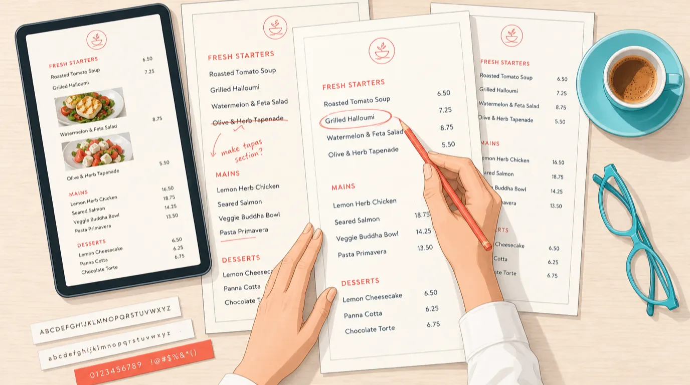
Kill the dotted leader lines. A row of dots running from the dish name to a right-aligned column of prices turns your menu into a price list, and the guest reads down the column choosing by number instead of reading the food. Set the price immediately after the description, in the same size and weight as the body text.
Skip the .99 in full service. Charm pricing signals discount, which is exactly what a QSR wants and exactly what a bistro does not. Round numbers, or .50 where you need the middle ground, read as confidence.
Avoid stacking prices in a neat vertical run even without the dots. Any alignment that lets the eye scan prices alone rather than dishes alone will get used that way, and cheap wins by default.
How the prices themselves are set is a bigger subject than the design, and it deserves its own read: menu pricing strategy covers the food cost math, the margin targets, and how to raise a price without losing the room.
Typography, layout, and the light in your dining room
Readability beats beauty, and most menus fail on it in the same three ways.
Type too small. Body text under 10 point is a struggle for a good number of your guests, and a menu that has to be held at arm's length or lit with a phone torch is a bad experience delivered at the worst possible moment. Twelve point is a safer floor for full service. If your room is dim, go bigger and increase the contrast, because the pretty grey-on-cream you approved under studio lighting is unreadable at candlelight.
No hierarchy. The guest should be able to find categories without reading, which means category headings need clear separation from item names, and item names need clear separation from descriptions. Weight, size, and space do this. Colour and italics do it less well than people expect.
Too little white space. Cramming forty items onto one side of A4 to save a print run makes the menu feel cheap and the food feel like fuel. Space around an item reads as importance, which is why the tasting menu on its own card feels expensive before you have read a word of it.
Format follows the room. A single page, held once, works for a menu of twenty-five items and keeps everything in view. Folded and multi-page menus hide their inside pages, so if you use them, put your money items on the visible spreads and know that the back page is where items go to be forgotten. Physical qualities count too. Card stock that has gone soft at the corners tells a guest something about the kitchen, whatever the food is like. Laminate wipes clean and reads as canteen; uncoated stock feels considered and does not survive spilled wine.
Photography: helpful, or a tell
Photos on a menu do two opposite things depending on context. In quick service, delivery, and any digital ordering flow, images lift conversion and average order value, because the guest is choosing quickly with no server to ask and the picture does the describing. In full service, photographs of food on the table menu read as downmarket in most markets, and one bad photo undoes a page of good copy.
If you use them, use them sparingly and shoot them properly. One photo per category at most, on the items you want to sell, taken of your actual plate at the portion you serve. Stock photography of a dish you do not make is the fastest way to set an expectation the kitchen will fail, and guests notice.
Digital is where the rules invert entirely. Your online ordering and delivery listings should have an image on nearly everything, because in a scrolling list an item without a photo looks unavailable. That includes the menu on your own site, which is usually the first place a prospective guest looks and often the worst-maintained page in the business. If yours is still a PDF, it fails on a phone, and a restaurant website builder that keeps the menu as real text will do more for bookings than another round of print design.
Designing for a phone is a different job
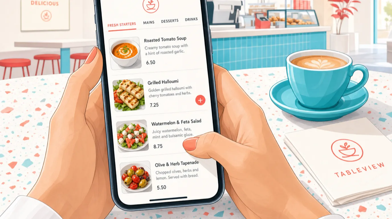
A phone shows one item at a time. Everything you know about relative positioning, anchors, and reading order still applies, but the canvas is a column two items tall, and the guest scrolls with a thumb while standing up or sitting on a bus.
That changes a few things. Category navigation has to be sticky or tabbed, because scrolling forty items to reach desserts is where orders get abandoned. Your best sellers and highest-margin items belong in the first screenful, since the fold is real and most guests never reach the bottom of a long list. Modifiers need to be short and clearly priced, or you get abandoned baskets at the moment of adding a side. And an item's description gets read more carefully than on paper, because there is no server to ask, so the copy carries more weight rather than less.
QR menus deserve one specific warning: a QR code that opens a PDF is worse than no QR code at all. Pinching and zooming a print document on a phone in a dark room is genuinely unpleasant, and it makes the restaurant look like it did the minimum. If you are going digital, build for the screen. The tradeoffs are covered in QR code menus for restaurants.
Allergens, accessibility, and the parts that are not optional
Allergen information is a legal requirement in most markets and a trust issue in all of them. The design question is where it lives. Icons beside each item are the clearest for guests and the most work to keep accurate, since every recipe change is now a design change. A referenced matrix, either on the back or handed over on request, is easier to maintain and slower for the guest. Digital menus solve this properly, because the allergen data sits with the item and updates everywhere at once.
Whatever you choose, never print a blanket disclaimer and consider it handled. Guests with a serious allergy will ask the server, so the real system is training, and the menu is only the front end of it. The kitchen side of that sits in food safety and HACCP.
Accessibility is the same argument made wider. High contrast, a type size that works at fifty as well as twenty-five, no critical information carried by colour alone, and a digital menu that a screen reader can actually parse. A large-print version costs one page and is quietly appreciated by more guests than will ever mention it.
Test it, then test it again
A menu is not a project with an end date. It is a control you adjust, and the reason most operators do not adjust it is print cost, which is a solvable problem: keep the fixed spine of the menu in print and put the moving parts, specials and seasonal items, on an insert or a board.
Change one variable at a time, otherwise you learn nothing. Move a single item's position, or rewrite one description, or reprice one dish. Then read the mix, not the total. Total sales move for a hundred reasons, and weather is one of them. Mix is the honest signal: did the share of orders going to that item change, and did contribution margin per cover follow.
Two weeks is a reasonable window for a busy site, four for a quieter one. Keep a simple log of what you changed and when, because in six months you will want to know why the dessert mix shifted and nobody will remember.
Then run the whole exercise on a cycle. Quarterly is a good rhythm for most independents: pull the twelve-week item report, rebuild the margin grid, cut the dead items, and reposition around whatever the season has made cheap. Menus decay quietly. Food costs move, suppliers change, the dish that carried you last year is now the one you make at a loss.
The mistakes that cost the most
A short list, drawn from the menus that most often need rescuing.
Pricing off the competitor down the road instead of your own food cost, which means importing their supplier deals and their rent into your margins. Keeping a dish because you are attached to it, or because one regular loves it, while it sits at 22 percent margin and slows the pass. Designing for the printer's grid rather than the guest's reading order, so the layout is tidy and the merchandising is accidental. Letting the online menu drift out of sync with the printed one, which produces exactly the kind of small disappointment that shows up in reviews. And changing everything at once, which feels decisive and teaches you nothing about what worked.
The last one is worth sitting with. Almost every menu that gets called a failure was actually a redesign of layout, copy, prices, and item list simultaneously, after which nobody could say which change moved the number.
Where to start this week
Pull the twelve-week item report and build the margin grid. That single exercise will tell you which four or five items you should be selling and are not, and it takes an afternoon. Then reposition those items, rewrite their descriptions, and cut the bottom five performers. Leave the typography, the stock, and the logo exactly as they are for now.
Fix the online menu next, because more people will read it than will ever hold the printed one. Real text, current prices, an image on the items you want to sell, and a phone layout that does not need pinching. Once those two things are done and measured, the visual redesign becomes a much easier conversation, because you will know what the menu is supposed to be selling.
Read next: Menu engineering, menu pricing strategy, and menu management systems.