Open ten restaurant websites on your phone and count how many make you sit through a slideshow, a cookie banner and a newsletter pop-up before you can see a single dish. Usually it's most of them. Good restaurant website design has less to do with looking impressive than with getting a hungry person from "where shall we go?" to a booking, an order or a set of directions in a couple of taps. Plenty of award-winning sites fail that test. Plenty of plain ones made with a restaurant website builder pass it without trying.
Design still matters, and a lot. The site is often the first look anyone gets at your room, your food and your prices, and people make up their minds about all three in seconds. The point is to spend the effort where guests actually look: the first screen, the menu, the photos and the buttons. Of those, the menu deserves the most care, and when it's the same menu that runs your QR menu and mobile ordering, it can't drift out of date.
What makes a good restaurant website design?
The best restaurant websites look nothing alike. A taqueria's site and a tasting-menu restaurant's site shouldn't. Underneath, though, the good ones get the same handful of things right:
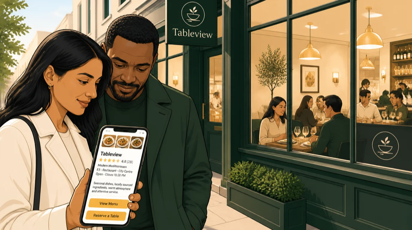
- The first screen on a phone says what you serve, where you are and whether you're open today.
- One obvious button for the thing you most want people to do, whether that's booking, ordering or calling.
- A menu written as text on the page, with prices, rather than a PDF or a photo of the printed one.
- Photos of your own food and your own room, shot in a consistent light and style.
- Two typefaces at most, and text dark enough to read on a phone in sunshine.
- Address, hours and phone number on every page, with directions and calling one tap away.
- Pages that load fast on mobile data, without autoplay video or sliders.
- A look that matches the room, so nobody walks in surprised.
None of that needs a big budget. It needs someone to make decisions and stick to them.
The first screen does most of the work
A typical phone screen is around 390 pixels wide and maybe 650 tall once the browser has taken its share. That's all the space you get to answer three questions: what kind of place is this, is it near me, and can I go tonight?
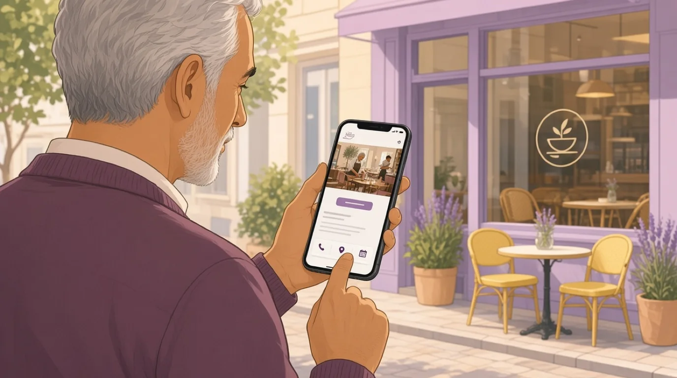
So that first screen needs the name, a line a stranger would understand ("Neapolitan pizza and natural wine in Leith", not "A culinary journey"), one strong photo, today's hours and your main button. If bookings pay the bills, the button says Book a table. If you live on collection orders, it says Order now. Two buttons is fine. Five is a navigation bar pretending to be a call to action.
Four things reliably wreck it:
- Full-screen video that plays on load. It looks wonderful on the designer's laptop, chews through mobile data, and phones in low-power mode often won't play it at all.
- Sliders and carousels. Most visitors never wait for slide two, so whatever is on it goes largely unseen.
- Pop-ups asking for an email address before anyone has seen the food.
- A logo so big that everything useful sits below the fold.
Here's a quick check. Hand your phone to a friend, open the homepage and ask them to find out whether you're open on Sunday evening and roughly what a main course costs. Count the taps. If it takes more than two for either answer, something is in the way.
Design the menu page before anything else
On most restaurant sites the menu is the page people go looking for, often straight from Google, skipping the homepage entirely. Yet it's usually designed last, after the hero and the about page, and it gets whatever time is left. Turn that order round.
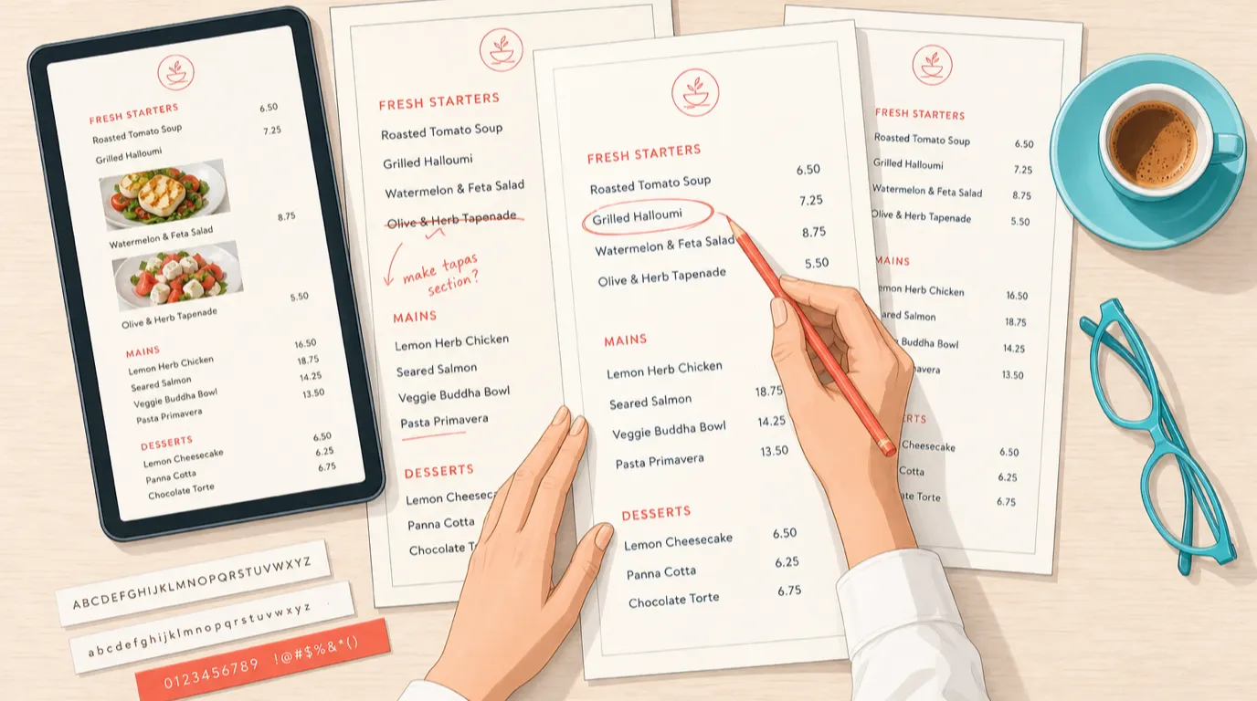
Start with structure. Group dishes the way people decide, which normally means the way the printed menu does it, and on a long menu add a row of section links at the top (Starters, Mains, Pizza, Desserts, Drinks) that stays visible as people scroll. Separate menus for lunch, dinner, brunch and drinks work best as tabs on one page, not as four links to four files.
Then the dishes. Short descriptions that say what's on the plate, prices visible next to each one, and no hunting for the currency. Dietary and allergen markers should be small, consistent icons with a key at the top of the page, and they have to be right, which is a process question as much as a design one. Managing allergens in a restaurant covers the process side. The ordering of items, the decoy dish and where the price sits are the same tools you'd use on paper, set out in menu design principles.
Text matters for more than looks. A menu written as real text can be read by Google, enlarged by someone with poor eyesight, read aloud by a screen reader and translated by a tourist's browser in one tap. A scanned menu can do none of those things.
Photos belong on the menu page, but not on every line. Six or eight images of the dishes you most want to sell will do more than sixty thumbnails, and they keep the page light.
The last problem is keeping it correct. The menu on most restaurant websites is out of date within a month, because changing it means emailing whoever built the site. When the website menu is the POS menu, that goes away. With Tableview's Instant Site, the items, prices, photos and allergen tags come straight from the back office, and when the kitchen 86s a dish on the POS, it disappears from the website too.
Typography and colour: borrow from the room
You already have a brand, even if nobody has ever called it that. It's on the sign over the door, the printed menu, the tiles, the napkins and the staff aprons. The site should look like it belongs to the same place. A guest who books from a sleek black-and-gold website and walks into a cheerful family trattoria has been misled, however nice both are.
Pick two typefaces and stop. One with character for headings, usually the one on your sign or close to it, and one plain, readable face for everything else, menu included. Script and novelty fonts are fine for a name or a single heading. On a list of thirty dishes they become a chore.
Size and contrast are where restaurant sites most often go wrong. Body text should be at least 16 pixels on a phone. And the accessibility guidelines most designers work to, WCAG at level AA, ask for a contrast ratio of at least 4.5 to 1 between normal text and its background, or 3 to 1 for large headings. Pale grey on white fails. So does thin gold lettering on black, the default look of half the cocktail bars on the internet. Free contrast checkers will tell you in seconds whether your colours pass.
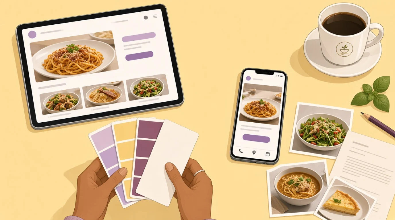
For colour, take two or three from the room and keep one accent colour just for buttons. If the Book button is the only terracotta thing on the page, people find it without looking. If terracotta is also the heading colour, the border colour and the background of the footer, the button disappears into the furniture.
Dark backgrounds suit late-night venues and can look excellent. Just check the contrast twice, keep body text off pure black where it starts to shimmer, and test the page outdoors at midday, where a lot of people actually look at it.
Photo direction, not just photos
Most advice stops at "get good photos". The difference between a site that looks expensive and one that looks pieced together is usually consistency: the same light, the same kind of surface and the same angle across every shot, so the images look like they came from one shoot rather than four phones over three years.
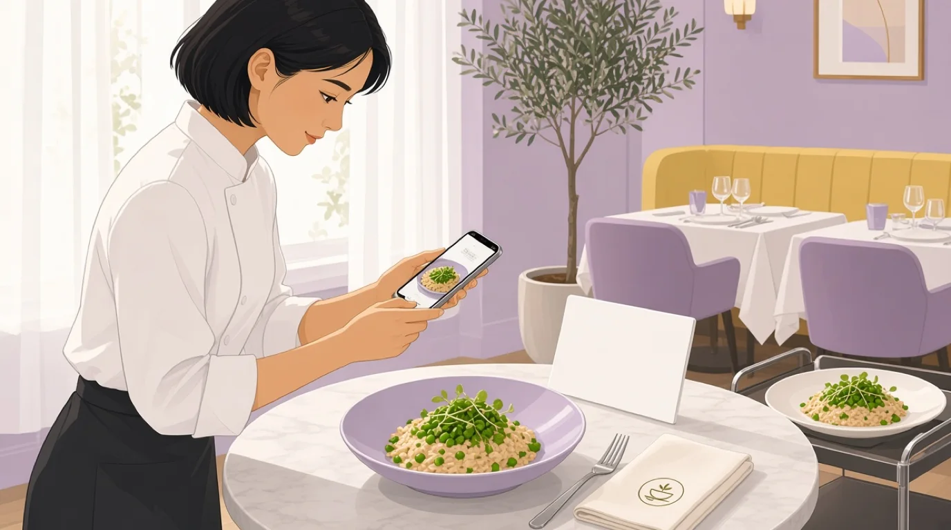
A few choices help:
- Shoot by a window, in daylight, on the same table every time. Diffused natural light flatters food far more than the dining room's warm bulbs.
- Match the angle to the dish. Pizzas, bowls and sharing boards look best from directly above. Burgers, layered desserts and tall cocktails want something nearer eye level.
- Leave space around the subject. The same photo will be cropped wide on a laptop and tall on a phone, and a dish framed edge to edge loses its garnish in one of them.
- Show the room with people in it, with their permission. An empty dining room photographed at 3pm says the place is quiet.
- Skip stock photos. Guests notice, and a stock burger sets an expectation your burger then has to meet.
Once you have them, export the images at the size they'll actually be shown, in a modern format such as WebP, and give each one a short description of what's in it. The technical side of the build, from domains to page speed, is in building a restaurant website, so there's no need to repeat it here.
Buttons, bookings and the thumb
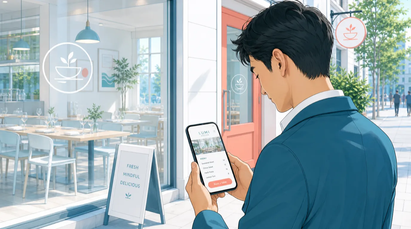
Most people browse a restaurant site one-handed, often while walking or standing at a bus stop. The bottom of the screen is the easiest place for a thumb to reach, which is why a slim bar fixed to the bottom with Call, Directions and Book works so well on mobile. It stays put while people scroll the menu, so the next step is always a tap away.
Make every tap target big enough to hit. Apple's design guidelines recommend at least 44 by 44 points, and WCAG 2.2 sets 24 by 24 pixels as the minimum. Label buttons with verbs that say what happens: Book a table, Order for collection, Call us. "Learn more" tells nobody anything.
The phone number should be a real link that starts a call, and the address should open in the guest's maps app. Both sound obvious and both are missing from a surprising number of sites. With Instant Site, click-to-call, opening hours and one-tap directions sit on every page by default.
Bookings deserve particular care. Sending people to a separate page that slowly loads a third-party widget loses some of them at the exact moment they'd decided. Either embed the booking form properly or keep the request on your own site. Instant Site sends reservation requests straight to your inbox and back office. If you're weighing booking tools, choosing a reservation system sets out the options.
The same applies to ordering. If the Order button sends people to a delivery app, you're paying commission on customers who came looking for you. Point it at your own online ordering where you can. How that fits together with the till is covered in POS with online ordering.
Restaurant website design examples by venue type
The right design depends on what guests come to do, and that varies far more between a takeaway and a tasting menu than any template gallery admits. Here's how the priorities shift.
Neighbourhood bistro or trattoria
Regulars make up the bulk of the trade, and they want to know what's on this week. Lead with a warm photo of the room at service, the hours and a Book button, then a short "this week" block with the specials. Keep the tone friendly and the layout simple. If the specials change daily and come from the POS, they're never wrong.
Fine dining
Restraint suits the format: lots of white space, large photography, a confident serif. But don't let elegance hide the practical things guests need before spending a few hundred on dinner. Say the price of the tasting menu per person, how far ahead bookings open, the deposit or cancellation terms, the dress code and whether you can handle dietary requirements. Guests resent having to email to find out. A page for gift vouchers earns its keep here too.
Pizza, burgers and takeaway
Here the website is a shop. Order now goes at the top, followed by delivery areas, collection times and a menu with photos of the best sellers. Speed matters more than atmosphere, and every extra screen before checkout costs orders. Run it from the same system as the counter and the kitchen, which is what a takeaway and delivery POS is for.
Café or bakery
Opening hours carry more weight than usual, because people check them at 7am. Put them on the first screen, then what's on the counter today, a map and the practical questions: laptops, dogs, high chairs, oat milk. Allergen information for the bakes saves the staff a dozen questions a morning.
Cocktail bar or club
Dark, moody design fits, as long as the text still passes the contrast test. The events calendar is often the most visited page, followed by table booking or the guest list. Add the age policy and the door policy where people will see them before they travel, not after they've queued.
Hotel restaurant
The restaurant has to stand on its own, with its own page or site that works for non-residents, because many people searching for dinner don't realise the hotel restaurant is open to them. Say so plainly. Give it its own hours, menu and booking button instead of burying it three levels deep in the hotel's room booking site. The wider picture is in hotel F&B management.
A group with several sites
Start with a location picker, then give each venue its own page with its own hours, menu, photos and booking. Keep the template identical across all of them so the brand holds together and a menu change can roll out everywhere at once. Running the operations behind that is the subject of managing multiple restaurant locations.
How to choose restaurant website templates
Templates are sold on their demo photos, which were shot by professionals with props and perfect light. That's not what your site will look like. So test a template with your own material before you commit to it:
- Your longest dish name and your wordiest description. Does the menu still line up?
- Your worst photo. Good templates survive an average picture.
- Your full menu, all sixty items of it, plus the drinks list.
- Your real hours, including the odd Monday closure and the split shifts.
- A phone, held in one hand, on mobile data.
Beyond that, check the parts that matter later. Can you edit text and photos yourself without a developer? Is there a proper menu block rather than a text box? Does it include hours and location sections, and do the buttons stay visible on mobile? Can you change the page titles and descriptions Google shows? Can you use your own domain?
Instant Site's templates were built for hospitality from the start, with versions for restaurants, cafés, bars, clubs and takeaways. You edit blocks on the page itself (hero, gallery, hours, location, story, menu), your logo, colours and fonts carry across every page, and every layout works on mobile without a separate setup.
It also costs nothing extra. Instant Site is included in every Tableview plan, including Starter at 69 dollars a month, so there's no separate website subscription and no hosting bill on top of the till. What each plan covers is set out in the Tableview pricing plans.
Accessibility belongs in the design brief
An accessible site is a better site for everyone, and most of the work is decisions you're making anyway. Contrast that passes. Text instead of pictures of text. Alt text on photos that says what's in them. Buttons that work with a keyboard. Menus that a screen reader can read in order. Video, if you use it, with captions.
There's a legal side too. In the United States, restaurant websites have been the subject of a long run of accessibility lawsuits under the Americans with Disabilities Act, and in 2019 a federal appeals court held in the Domino's case that the act applied to the chain's website and app. In the EU, the European Accessibility Act has applied since June 2025 to a range of digital services, with an exemption for the smallest businesses. Whether and how either applies to you is a question for a lawyer, not a web designer. Designing for accessibility from the start is far cheaper than retrofitting it after a complaint.
Speed is a design decision
Slow sites are usually slow because of design choices: a 6 MB hero image, four web fonts, a background video, a gallery that loads forty photos at once. Google measures loading through its Core Web Vitals, and treats a page as good when the main content appears within 2.5 seconds, the page responds to a tap within 200 milliseconds, and the layout doesn't jump around as it loads.
Agree a simple budget with whoever designs the site. Keep the hero image to a few hundred kilobytes, stick to two font families, skip autoplay video, and load gallery images only when someone scrolls to them. Instant Site pages are tuned for Core Web Vitals out of the box, which covers most of this without anyone thinking about it.
Design for Google as well as guests
Search engines read the design too, just differently. Each page needs a title that says what and where ("Marisco | Seafood restaurant in Lisbon's Cais do Sodré") and a heading on the page that does the same in plain words. The menu, as text, gives Google the dish names people actually search for.
Behind the scenes, structured data tells search engines that the page is a restaurant, with its address, hours, cuisine and whether it takes reservations. Instant Site adds local business structured data and a sitemap automatically. Your name, address and phone number should match exactly what's on your Google Business Profile and the directories, down to the abbreviations. The ranking side of all this is covered in local SEO for restaurants.
How to design a restaurant website, step by step
If you're starting from nothing, or redoing a site that has grown messy, this order saves time:
- Decide on the one action that matters most: booking, ordering or visiting. It sets the main button and much of the layout.
- Write the first screen in words before choosing any visuals: the name, the one-line description, the hours and the button.
- Lay out the menu with its sections, descriptions, prices and dietary markers, and connect it to your POS menu if you can.
- Pull your typefaces and colours from the room and the sign, and pick one accent for buttons.
- Shoot a consistent set of photos: ten dishes, the room busy, the room empty, the outside, the team.
- Choose a template and test it with your real content, on a phone.
- Add the practical pages: location, booking or ordering, private dining, gift vouchers, contact.
- Check contrast, tap sizes and loading speed, then connect your domain and publish.
- Look at it again a month later. Fix the first thing that annoys you.
Most restaurants can get through steps one to five in an afternoon with a notebook and a phone camera. The rest goes quickly once those decisions are made.
Show it to a stranger before you launch
You know your own site too well to judge it. Before it goes live, find three people who've never eaten with you, give each a phone and one job: book a table for Saturday, find something vegetarian under 20, get directions from the station. Watch without helping. Every time someone hesitates, there's a design problem, and it's far cheaper to fix now than after a month of lost bookings.
Then keep it current. A restaurant website that's designed well and kept up to date beats a beautiful one that still lists last winter's menu.
Read next: your Google Business Profile for the listing people see before your site, restaurant social media marketing for the photos once you have them, and managing restaurant reviews for what guests say about you elsewhere.